


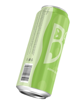
Bamboo Bear is the next best ready-to-go drink for all you boba lovers!
We're coming in sweet with our favourite Jasmine Green Tea, your classic Strawberry, and even the rare Winter Melon flavour you've been looking for. Try our premium, triple-distilled vodka with the classic chewy pearls from all your boba drinks.
Check out @alliauras.artboards on Instagram for more details


toronto zoo


Did you know the money from your Toronto Zoo memberships goes directly toward saving endangered species like the red panda and highland cows?
This campaign uses a serious tone to create an immediate emotional connection. The posters are strategically crafted for Toronto transit shelters and Instagram sponsored ads to reach a wider urban audience.
social media
Below you'll find a mix of promo posts I've designed for 2 separate baking businesses as well as some work from my internship with the TCDSB communications department.


Logos

Company description
Small business specializing in personalized, handcrafted ribbon florals
Get a glimpse of the creative choices behind this logo by hovering over.

The Brief
The client need a scalable logo to seamlessly fit across digital platforms, mobile media, and stationery items.
The Concept
Since custom florals is their USP, I wanted the logo to reflect their handcrafted touch. By taking a daisy and integrating it with a calligraphic font, attention is guided smoothly across the logo. Their calming, trustworthy Yale Blue paired with a passionate, energetic raspberry red perfectly balances what their brand mission.

Company description
Skateboard shop, selling cartoon-themed skateboard decks
Get a glimpse of the creative choices behind this logo by hovering over.
The Brief
Create a logo that'd sit appropriately on a skateboard deck.
The Concept
Skateboarding is often associated with a bold, edgy community. So I appealed to the target audience through the typography. As for the monochromatic colours, it's the perfect foundation for contrast whilst also meant designed for any colour best suited for the theme of the skateboard.

Company description
Mobile role-playing game (RPG) aimed to educate children (Grade school) the basics of chemistry, biology, and physics.
Get a glimpse of the creative choices behind this logo by hovering over.
The Brief
Create a quadradius logo in the shape of an animal for a made up brand. The challenge is being limited to only circular elements.
The Concept
The owl and shade of blue were intentionally chosen for their educational symbolism. The amber glow orange is commonly used in digital creations but the orange itself encourages enthusiasm.


